Measure Maze: Visualizing Measure Dependencies Using Semantic Link & Network Analysis
Python package to analyze dependencies in a Power BI semantic model
Principal Program Manager, Microsoft Fabric CAT helping users and organizations build scalable, insightful, secure solutions. Blogs, opinions are my own and do not represent my employer.
In my previous blog post, I introduced Semantic-Link, discussing its use cases and explained how it enables us to create solutions that were either not possible or not easily achievable before. In this blog post, I would like to present another powerful use case that, although possible in the past, could not be created and used seamlessly in Power BI. Allow me to introduce the MeasureMaze Python library, which helps uncover insights from a complex maze of dependencies in a Power BI semantic model using Semantic-Link and the power of network analysis.
When you are developing complex analytics solutions using Power BI, you will typically have hundreds of measures that are interdependent with each other. If you need to find dependencies among these measures, you have to use external tools (Tabular Editor and DAX Studio) which work great but these tools don't allow you to find insights or show critical measures without additional analysis. MeasureMaze aims to plug that gap using Semantic-Link and network analysis in a Fabric notebook. I have used this approach before in my work and wanted to build on it after the release of Semantic-Link.
Pre-Requisites:
Microsoft Fabric
Premium workspace and dataset in a Fabric tenant
Installation
To get started, install the MeasureMaze library from my github. You can pip install it in a Fabric notebook.
#Install Measure Maze in a Fabric Notebook
!pip install https://github.com/pawarbi/MeasureMaze/raw/main/measuremaze-0.0.1-py3-none-any.whl --q
If you want to follow along with me, publish this Profit Analysis pbix to a Premium (F, P or PPU) workspace in a Fabric tenant.
After installing the library, import it and let's get started.
#Import Measure Maze
from measuremaze.map import get_dependencies, PlotDependencies

#Specify Premium workspace and dataset id or name
ws = "90d7b4f7-9c0f-425c-87f1-xxxxxxxx"
ds = "a52cde7b-9497-4cfa-a133-xxxxxxxx"

#Returns a FabricDataFrame with dependency mapping for the above dataset
df = get_dependencies(dataset = ds, workspace = ws)
df.head()
get_dependencies() uses SemPy under the hood to execute two DMVs to get all the dependencies and return a FabricDataFrame containing 5 columns:
Object Name : Measure or Calculated Column name
Expression: DAX Expression used to define the object
Dependent on : Measure, column or table used to define the object. If the object is a column (regular or calculated), it is always shown in Table[Column Name] format to quickly identify if it's a column or a measure. e.g. in the below table,
Net Salesis a measure whereasSales[Status]is a column.Type : Whether the Dependent on object is a column, measure or table
Folder: Home table and folder containing the object. Always starts with Table name followed by the folder name. i.e.
Table\Folder\Sub-folder\..

You can use this dataframe like any other pandas dataframe and filter/transform as needed. For example, we know that using IF , especially nested IF can cause DAX performance issues which can be optimized by using variables and SWITCH . We can filter the above dataframe to identify all objects that use IF. Using regex patterns can make this very powerful.

This dataframe shows the dependencies in a tabular format which is great for querying but not for understanding the dependencies quickly and visually. To do that, use the PlotDependencies class from MeasureMaze which contains several helpful methods.
PlotDependencies
Instantiate the class by passing the above dependencies dataframe
#Plot all objects
all_objects = PlotDependencies(df)
all_objects.show()
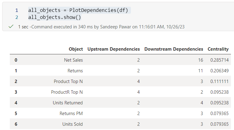
Above I passed the entire dependencies dataframe and used the .show() method to get a quick summary of the dependencies in a tabular format. This table contains four columns:
Object : This is measure or calculated column
Upstream Dependencies : Number of objects used to define the measure/calculated column
Downstream Dependencies : Number of objects that use the above measure/calculated column
Centrality : Measure of how central or connected a node is (more on this later). The higher the centrality score, the higher its importance in the network of dependencies
From the table, we can see that Net Sales measure is defined by 2 objects while it is used in 16 different objects. By default, the table is sorted by centrality score to provide a list of objects that are influential.
Using Folders
If you are like me, I always add measures to a folder to keep everything organized and logical, especially on large projects where it's typical to have hundreds of measures. In that case, you may not want to analyze all the measures and only look at a subset of measures in a folder or list of folders. PlotDependencies has an optional argument folder to help with that.

Above I am looking at the measures that are in the TopN folder in Design DAX table. Note here that the folder names must be specified in TableName\folder\sub-folder format. But what if you want to look at all the measures in the Design DAX table? You can specify the table too.
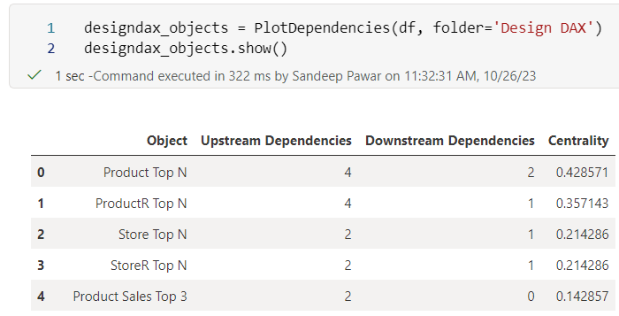
You can pass a list of folders as well. Below I am analyzing measures that are in two folders from two different tables. Using folders can help narrow down the scope.

startswith condition in the code so you just need to provide the initial letters of the folder name.Network Analysis
So far we have only done tabular analysis. However, my main objective with this project is to use network analysis to visualize and understand large dependency network. I have built several methods that can help depending on the use cases based on my experience working on large enterprise projects.
plot
To plot all the dependencies for all the objects that were in the dataframe used in PlotDependencies are plotted using the NetworkX and Graphviz libraries. Both of these libraries are installed during MeasureMaze installation.
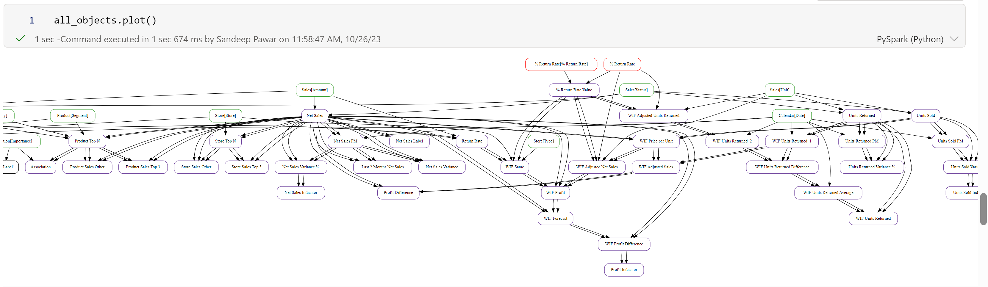
This plot visually shows how all objects are related to each other. By default, all objects from the dataframe are used but you can specify an object or list of objects to reduce the scope:

You can pass a list as well:

Nodes (i.e. objects) have colors based on the type of object.
Red: Calculated columns and calculated tables
Green : Regular column
Purple: Measure
Blue : Object under consideration.
In the above example, %Return Rate is a calculated table (because it's red in color and doesn't have Table[Column Name] format. %Return Rate[% Return Rate] is a calculated column. Sales[Unit] is a regular column. By default, when .plot() method is used, it will always show immediate upstream and downstream dependencies to show context.
plot() method is not restricted to measures and calculated columns only. You can pass a regular column to see which objects use that column:

In this example, Sales[Unit] column is used by four different measures. Sales[Unit] is blue because it's the object being plotted (again the colors are inconsistent and will be fixed later).
Plotting the dependencies and visualizing them can help with documentation as well as analysis. It's much easier to understand all the dependencies if you plot them instead of seeing them in a tabular format.
Configuring the plot
If the semantic model has hundreds of objects, the plots can get very crowded and difficult to see. There are three ways you can configure the plots:
layout: By default, the objects are plotted in a vertical layout, i.e. the upstream/downstream dependencies are laid out vertically (above and below the node). You can change that to
layout=horizontalwhich will work better in some cases.
graph_size : The default size is '20,20' which should work in most cases, but you can adjust that by changing the size
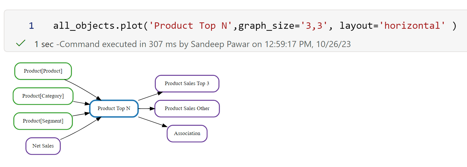
dpi: To increase resolution, set the dpi to a high value.
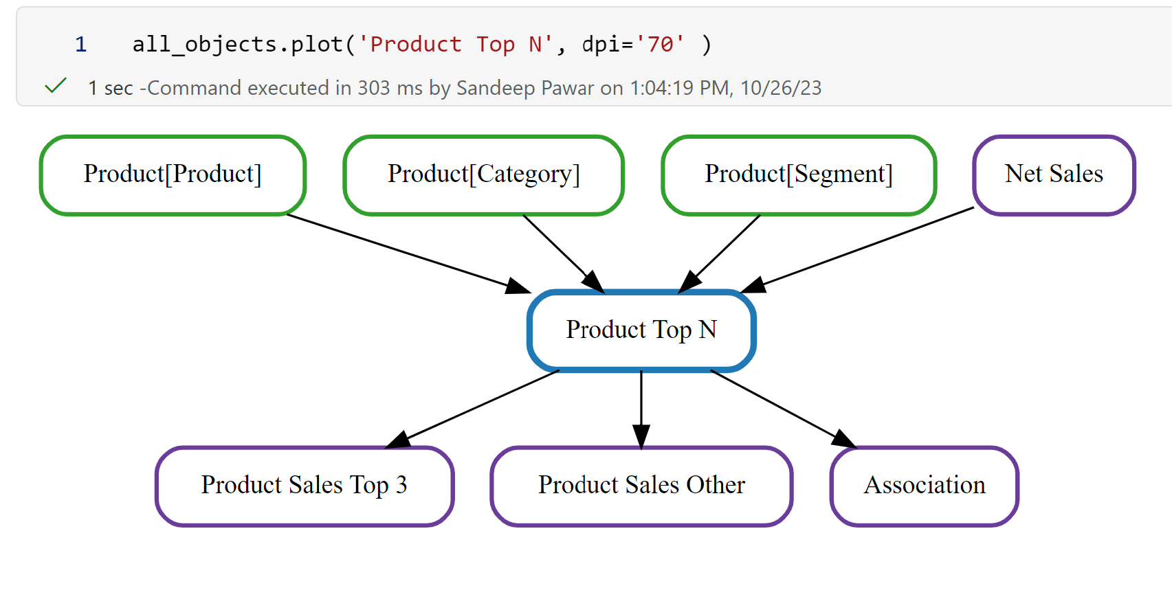
All three can be set at the same time to get the desired size and layout. It can still be challenging in a notebook if the number of objects is very large. My recommendation is to use a list of folders or objects to reduce the scope. I am planning on adding a way to export the plots as PNG or HTML for viewing them easily outside of notebooks.
Centrality
Before getting into data analytics, I worked as an engineer in an R&D team to design and analyze heat transfer products. It was my job to analyze test and production data and find insights to design better, stronger, and optimal products. I used network analysis frequently to analyze vast amounts of data that were interconnected with each other. I wanted to see if the same principles can be used on a network of measure dependencies, especially on large projects.
Centrality measures the importance of nodes in a network. A node that is highly connected to other nodes is deemed more important than a node with few connections. In the context of Power BI, it can help identify key objects that use many other objects or are used by other objects for their definition. These central or key objects can potentially:
influence many other measures and columns. Changing these could have a broad impact on the report results and performance
be bottlenecks if defined sub-optimally
be helpful for lineage tracing and auditing. Report authors could prioritize these objects for accuracy and auditing in their DataOps pipeline
be helpful for documentation
help to identify redundancy and complexity
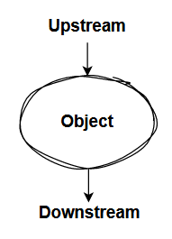
In the above network, node A is more influential than node F or node G because it has more connections.
I recently completed a project with over 400 measures with varying complexity and wished I had a way to highlight to the client how the measures were organized and designed.
Imagine, you took over the above project and quickly want to find out which are the key measures. You can do that using the centrality method in Measure Maze.
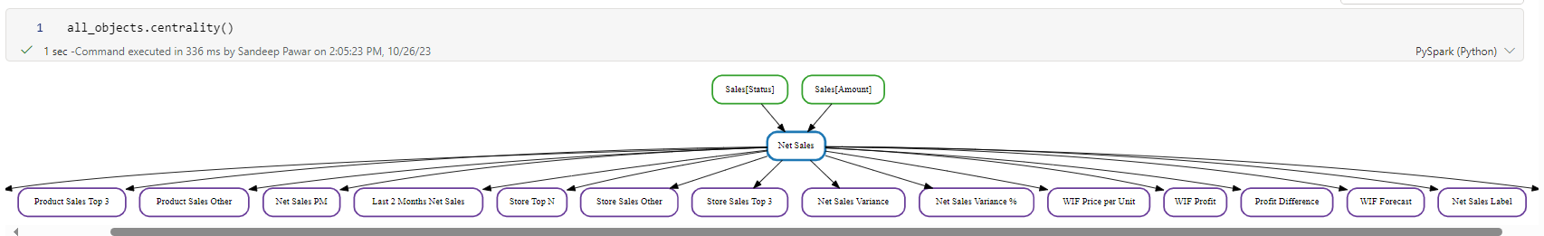
#Return node(s) with highest centrality score
all_objects.centrality()
Above, I used the centrality() method which returned Net Sales as the key measure because it has the highest number of connections upstream and downstream. It is used by 16 other measures in its definition. Without centrality, it would have been tough to identify this quickly.
Note that in this case a measure was returned but it could have been a column, a calculated column or a calculated table too if it's used by other objects.
Centrality Level
In all likelihood, you won't just have one key measure. You can return more than one by specifying the level of centrality desired. By default, it's the node with the highest centrality score. If level=2 is used, the top two nodes with the highest centrality are returned - Net Sales and Returns
#Return top 2 central nodes
all_objects.centrality(level = 2, graph_size='30,20')
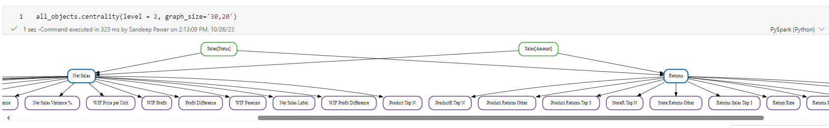
When the nodes are returned, it always shows the upstream and downstream dependencies to provide context. Though the default is level=1 , my recommendation would be to look at the top 5 nodes. In the most examples I have tested, that's sufficient to get a good understanding of how everything is defined and organized. We don't want to see too many isolated nodes which may indicate measures are not being re-used.
The table returned by .show() method also shows the centrality score for each object. I would like to point out that the default centrality method does not distinguish between the upstream and downstream dependencies. Below, ProductR Top N and Units Returned both have a total of 6 connections and hence the same centrality score.

A true key measure cannot be identified just by the number of connections but it is certainly one of the ways and can point in a direction.
Centrality Method
By default, 'degree' centrality method is used to calculate the centrality score. There are many more methods that may not be completely applicable to the type of network we are analyzing.
Degree : Nodes most directly used
Closeness: Nodes that spread information quickly through a network
Betweenness: Nodes that act as bridge between different nodes
Eigenvector: Nodes that are connected to other powerful nodes
All of these four methods are available in the .centrality method. e.g. below I used the closeness method:

Eigenvector, though powerful, needs a large network and is currently unstable in my implementation. I think in Power BI's context, degree makes more sense but I am still exploring to see if and how other methods will help. In future releases, I may drop them.
I highly recommend reading this book if you want to learn more about centrality and network analysis in general.
Depth
Thinking about different use cases, I realized that in some cases, I may want to know if there are measures that have a long dependency depth. e.g. a measure could be defined by a measure and a column. But that upstream measure will have its own dependency and so forth. This tall dependency chain could lead to a bottleneck that may have a cascading effect so I came up with another measure called - depth. Depth looks at the total number of unique upstream dependencies instead of connectedness.
#Returns objects with a long dependency chain
all_objects.depth()
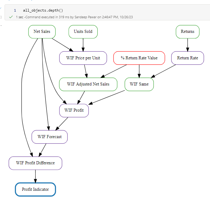
In the above example, Profit Indicator measure has 6 levels of upstream dependencies. If any of these objects are changed or defined sub-optimally, it will have a cascading effect on accuracy and performance.
Depth Level
You can specify a level, similar to centrality, to get more than one object. Below level=3 returned 3 measures (Profit Indicator, WIF Profit Difference, WIF Units Returned) with a long chain of dependencies. You can control the size via graph_size, dpi and layout.

Disregard the number of arrows. It's a big that I need to fix.
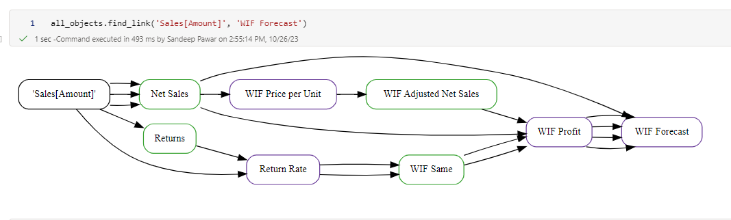
Find Link
Lastly, during development, you may want to know if there are any dependencies between two objects. This can be found by using find_link() method.
You can specify any two objects and if they share dependencies, they are plotted.
Dependency Analysis in Semantic Link
Semantic-Link also has methods to find functional dependencies between columns in a FabricDataFrame. The difference between the two is, plot_dependencies identifies relationships between columns in a dataframe.
from sempy.dependencies import plot_dependency_metadata

deps = df.find_dependencies()
plot_dependency_metadata(deps)
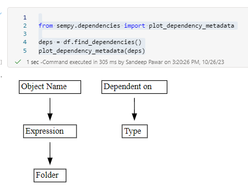
find_dependencies() correctly shows that Expression and Folder are related to the Object Name column while Type is related to the "Dependent
on" column.
This type of analysis is very helpful if you receive a big flat table and want to identify attributes that belong together to create a dimensional model.
Relationships
Semantic Link can also be used to plot relationships between tables.
from sempy import fabric
from sempy.relationships import plot_relationship_metadata


relationships = fabric.list_relationships(workspace=ws, dataset=ds)
plot_relationship_metadata(relationships)

You can also perform dependency violation analysis in SemPy which can be used to identify referential integrity violations and data quality issues. You can read more about it here.
Notes:
While I showed how to use this in a Fabric tenant and after the model has been published to service, MeasureMaze can be used with Pro datasets and locally with Desktop as well. I will write a separate blog post on that.
I am aware of issues with colors and multiple arrows. I will fix that in future updates.
This is the most amount of non-data related Python code (~500 lines) I have written so there are definitely ways to make the library faster and performant in its design. I am not a SE but if you are, happy to share the code with you if you would like to contribute.
If you find any bugs or have suggestions, please feel free to drop them here.
Currently, all the plots are static but can be made dynamic using Pyvis and plotly. I am looking into it and may update in the future.