Rendering HoloViews, Bokeh Plots in Fabric Notebooks
The solution to render Bokeh plots in Fabric notebooks
Principal Program Manager, Microsoft Fabric CAT helping users and organizations build scalable, insightful, secure solutions. Blogs, opinions are my own and do not represent my employer.
HoloViews and Bokeh are two popular interactive data visualization libraries in Python. HoloViews is an open-source Python library for data analysis and visualization. It is designed to make data analysis and visualization seamless and simple. With HoloViews, you can usually express what you want to do in very few lines of code, letting you focus on what you are trying to explore and convey, not on the process of plotting. Bokeh is another popular interactive data visualization library in Python. It provides elegant, concise construction of versatile graphics with high-performance interactivity over very large or streaming datasets.
In Fabric, Holoviews is not available by default and must be installed in the workspace Library Management or in the notebook by !pip install holoviews .
Once you install it, it is expected to work as expected, however, it does not. You will find that the code is executed successfully but the chart is not rendered. This blog shows you a simple solution to fix this. This is a known bug and will be fixed in future updates. Thank you to Chang Xu at Microsoft for the information.
When you import the HoloViews library, you will first notice that extra output is returned which it should not. Despite this bug, the library is successfully imported and this output can be ignored.

Next, I will create a sample dataframe from HoloView's documentation page for rendering:
macro_df = pd.read_csv('http://assets.holoviews.org/macro.csv', delimiter='\t')
key_dimensions   = [('year', 'Year'), ('country', 'Country')]
value_dimensions = [('unem', 'Unemployment'), ('capmob', 'Capital Mobility'),
                    ('gdp', 'GDP Growth'), ('trade', 'Trade')]
macro = hv.Table(macro_df, key_dimensions, value_dimensions)
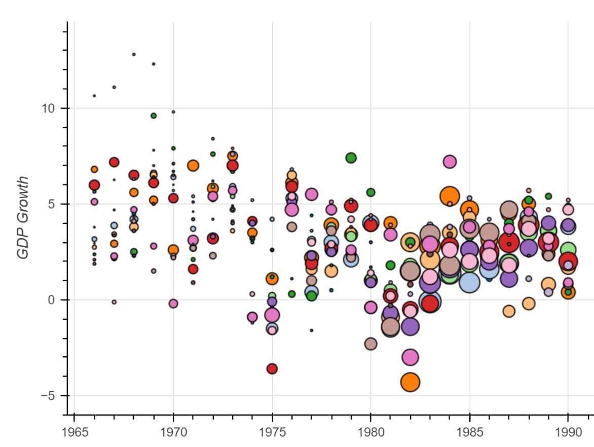
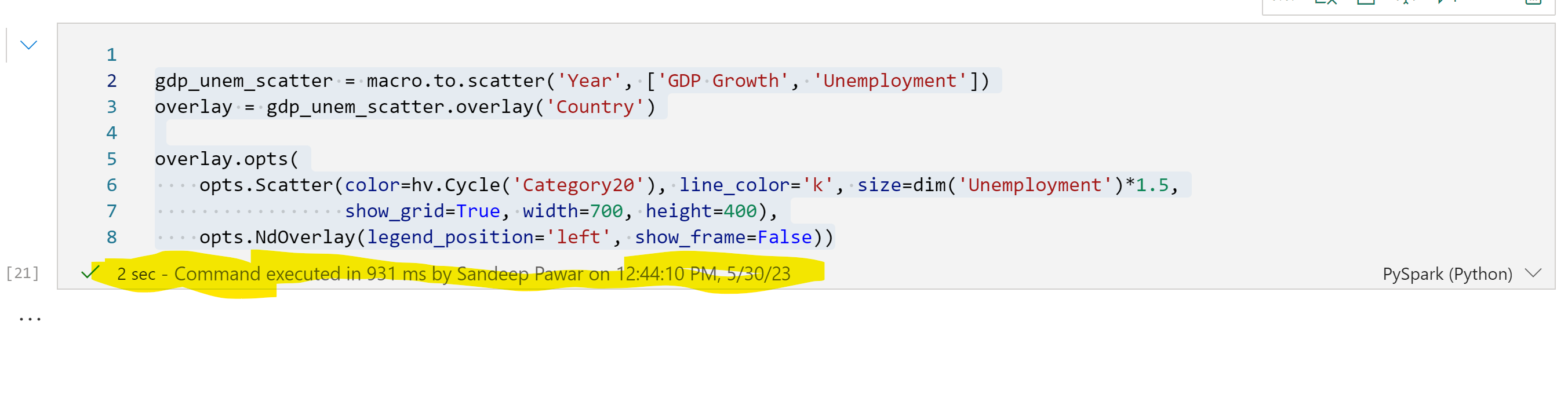
If now try to create a scatterplot, you will see that the code is executed but the chart is not rendered.
gdp_unem_scatter = macro.to.scatter('Year', ['GDP Growth', 'Unemployment'])
overlay = gdp_unem_scatter.overlay('Country')

overlay.opts(
    opts.Scatter(color=hv.Cycle('Category20'), line_color='k', size=dim('Unemployment')*1.5,
                 show_grid=True, width=700, height=400),
    opts.NdOverlay(legend_position='left', show_frame=False))
The Solution
The solution to this is to import bokeh with import bokeh.io and force the output by using bokeh.io.output_notebook():
import bokeh.io
bokeh.io.output_notebook()
This should plot the visual correctly. Use the same method if you are using hvPlot. Note that it's not enough to run this once. Anytime you have to create a plot you will have to add bokeh.io.output_notebook() to create the chart output successfully. As I mentioned, this is a bug and will likely be fixed soon.
